The User Interface
In this article, we explain the structure and key aspects of the user interface.Structure
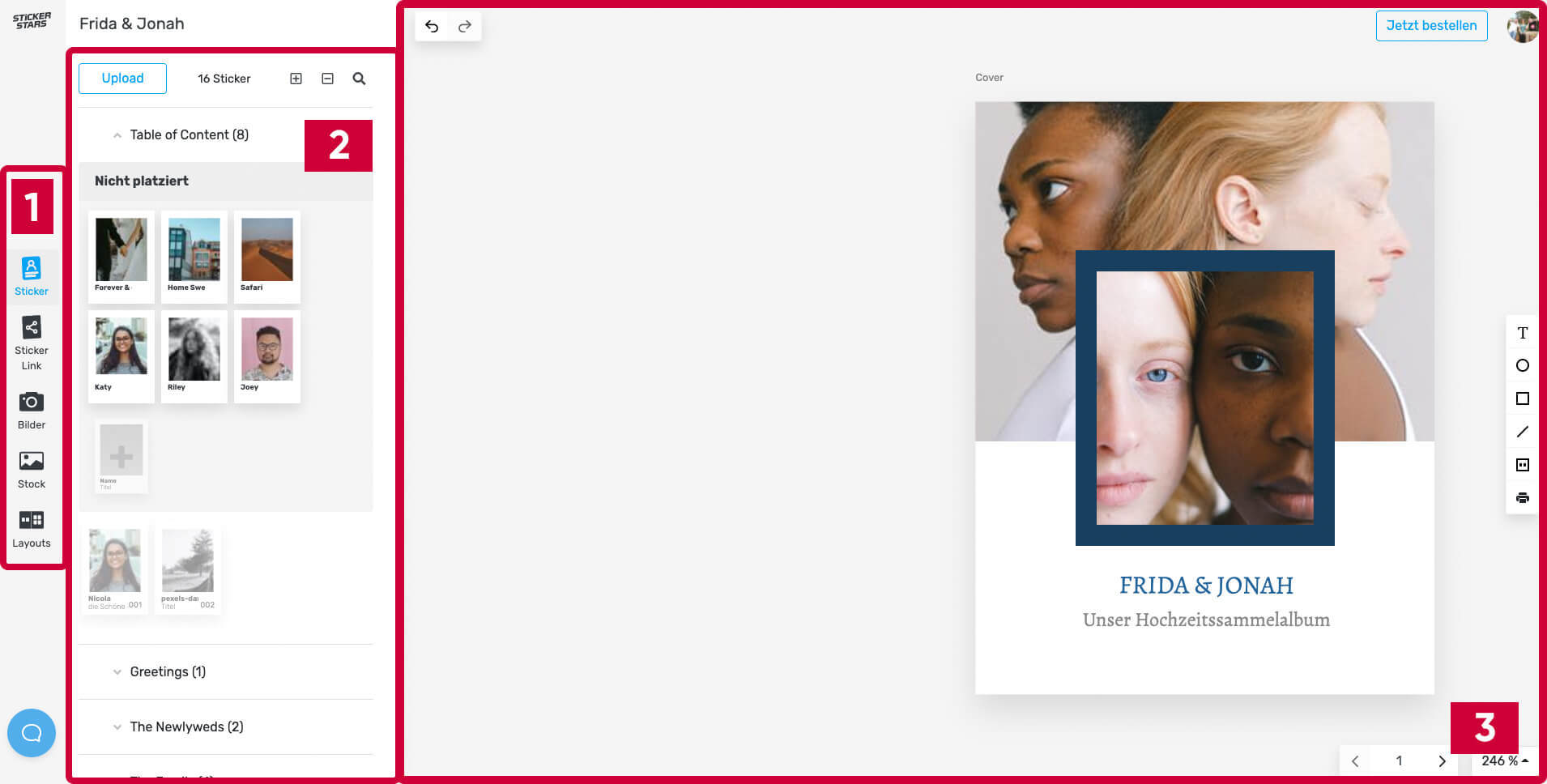
Once you've created your album, you'll land in the design view. This is where your stickers and inner pages are created. The interface of the design area is roughly divided into three sections:
- Menu
- Sidebar
- Canvas
These terms will appear repeatedly in the following tutorials.

The Menu
The menu allows you to navigate between the five functional areas of the designer:
- Home: Your "home page" to help you get started
- Stickers: Creation and management of chapters and stickers
- Sticker Link: Management of the sticker link
- Background: Upload and management of images for designing your album
- Layouts: Overview and selection of page layouts for designing your album
- Design: Here, you can configure the basics of your design: colors, fonts, etc.
At the bottom of the menu, you'll also find the blue support button for direct help via chat or to search for answers on our help pages.
The Sidebar
When you select one of the five functional areas in the menu, the corresponding sidebar for that area opens. Here, you can work on the respective menu item: upload, search, create, and customize content. It provides a simple overview of your album contents.
The Canvas
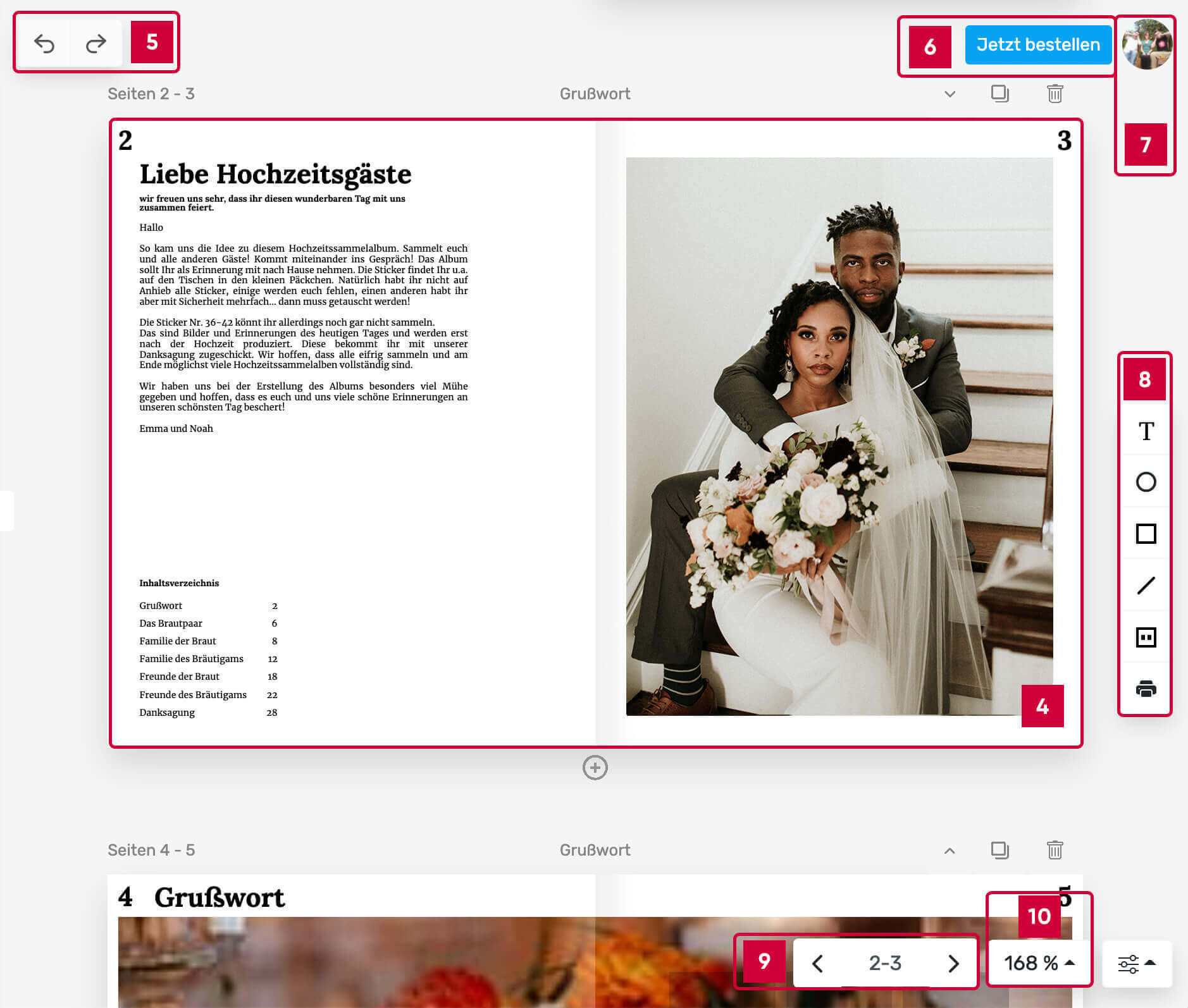
The canvas allows you to design the album according to your preferences. You'll likely spend most of your time in the designer here.

- Album Pages: Cover, double pages, and back cover form the core of your album.
- Undo/Redo: Undo (left arrow) reverts the last change, Redo (right arrow) reinstates the reverted change.
- Order Now: Link to the checkout
- Your Profile: Access your user profile, feedback, and logout
- Element Toolbar: Menu for creating elements (like text, shapes, and sticker areas)
- Page Navigation: Manually flip through the pages by clicking the arrows
- Adjust Zoom Level: Select one of the predefined zoom levels
You can also zoom using your mouse wheel (while holding the ctrl key) or a trackpad.